In my free time and even sometimes while I'm busy, I enjoy listening to music as I finish tasks that don't require listening to lectures or simple things that let me turn my brain off. While I enjoy most music, I mainly listen to Korean pop or hip hop as I've been learning the language. Because of this, I often gain a surge of creativity and as I like creating fun story lines as well, I began to make my own imaginary k=pop groups and began envisioning what their albums would look like.
The following are images are the results from the past few years
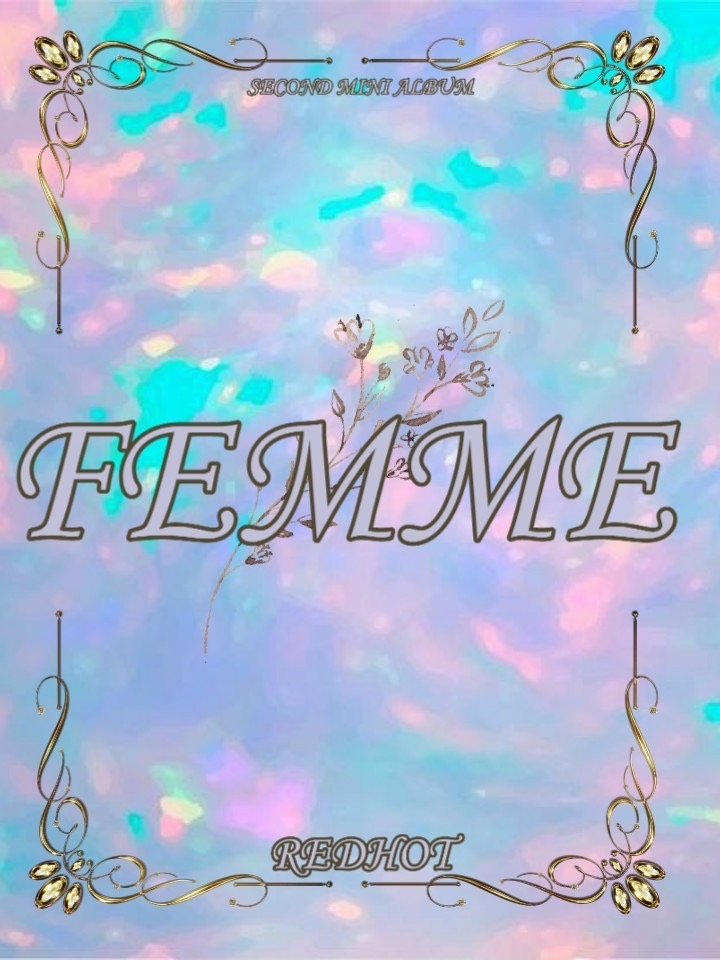
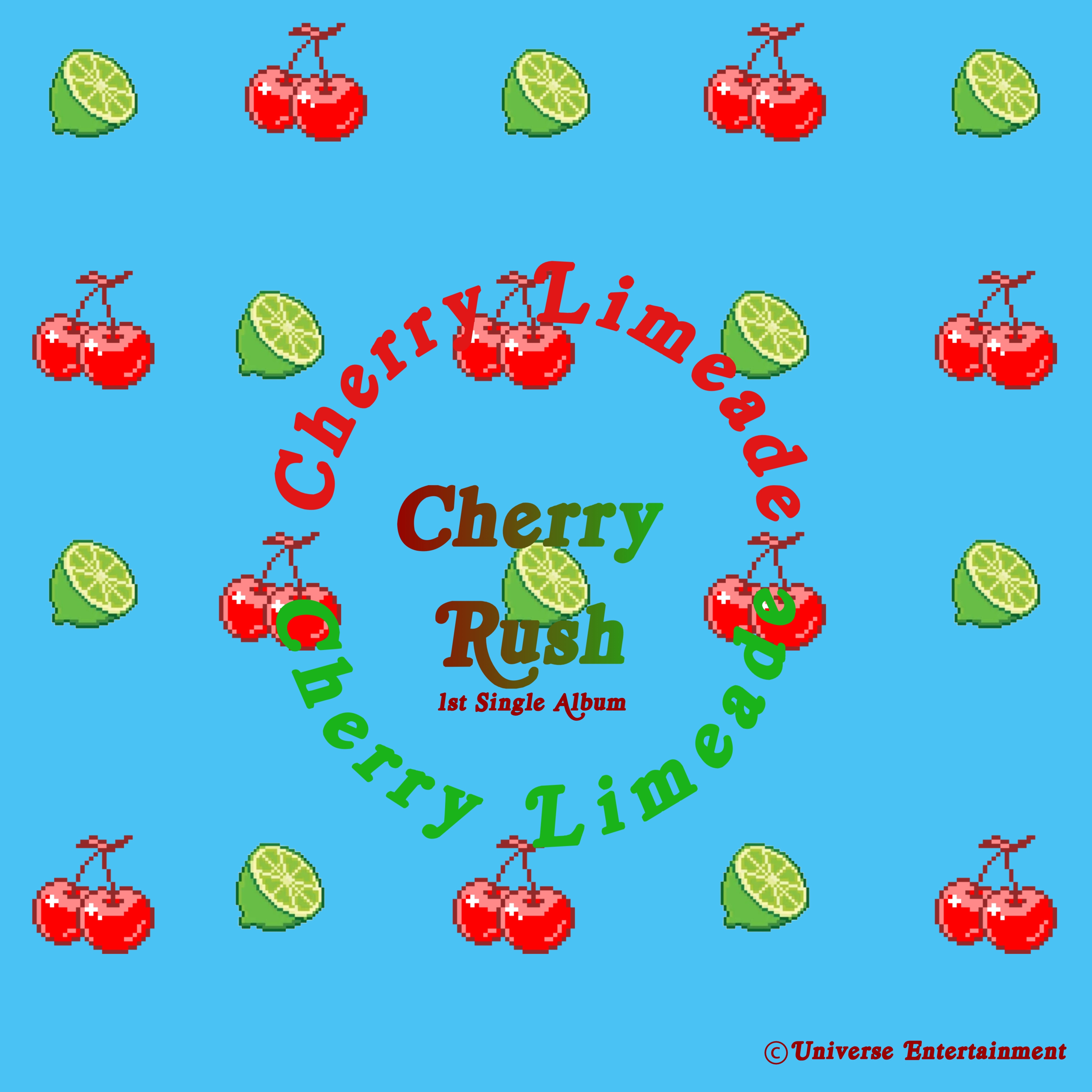
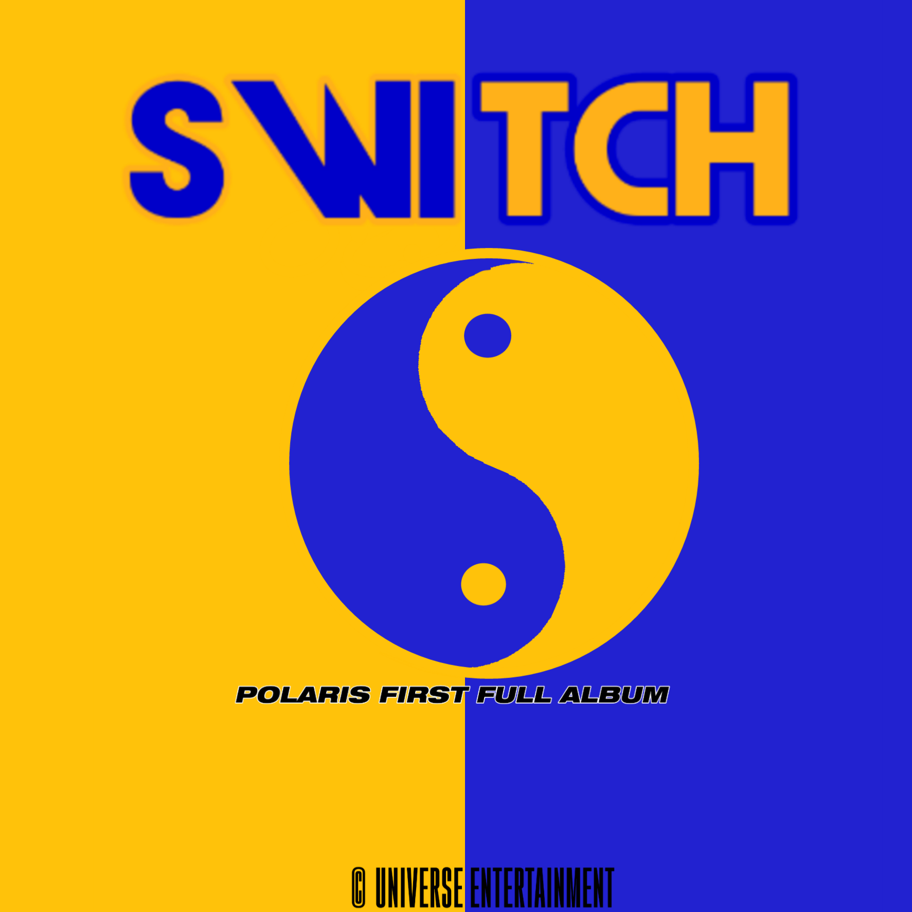
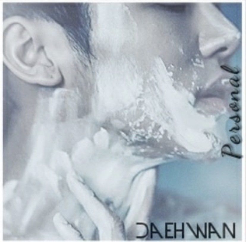
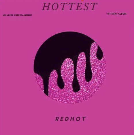
This album was created for my fictional girl group Redhot. The theme was very magical and mystical femininityThis album was created for Redhot's only subunit Cherry Limeade. The focus for this was more upbeat and summery with a touch of retro. I used a pattern of 8-bit cherries and limes to tie in the subunit's name, Cherry Limeade, as the album's name is 'Cherry Rush'.This album design is for my fictional group Polaris, a co-ed duo consisting of members Shin Daehwan and Kim Sorin. The name Switch comes from the pair going for a sound that is different from their usual music,switching up their sound for their first full sized album. This album design is for a member of my first fictional group, Polaris, Shin Daehwan. To match his personality, the design focuses on simplicity and cool tones as he is very down-to-earth and is not one to be overly flashy. The person in the image is Kang Insoo of MyName,a k-pop group who debuted in 2011.This design is for my fictional group Redhot. This is intented to be their first mini album as they previously only released digital singles. The focal point for this was Hot Pink by the existing girl group EXID in which the music video showcases of viscous pink substance. I took inspiration from that and used a black drips over a glittery hot pink center to add edge.
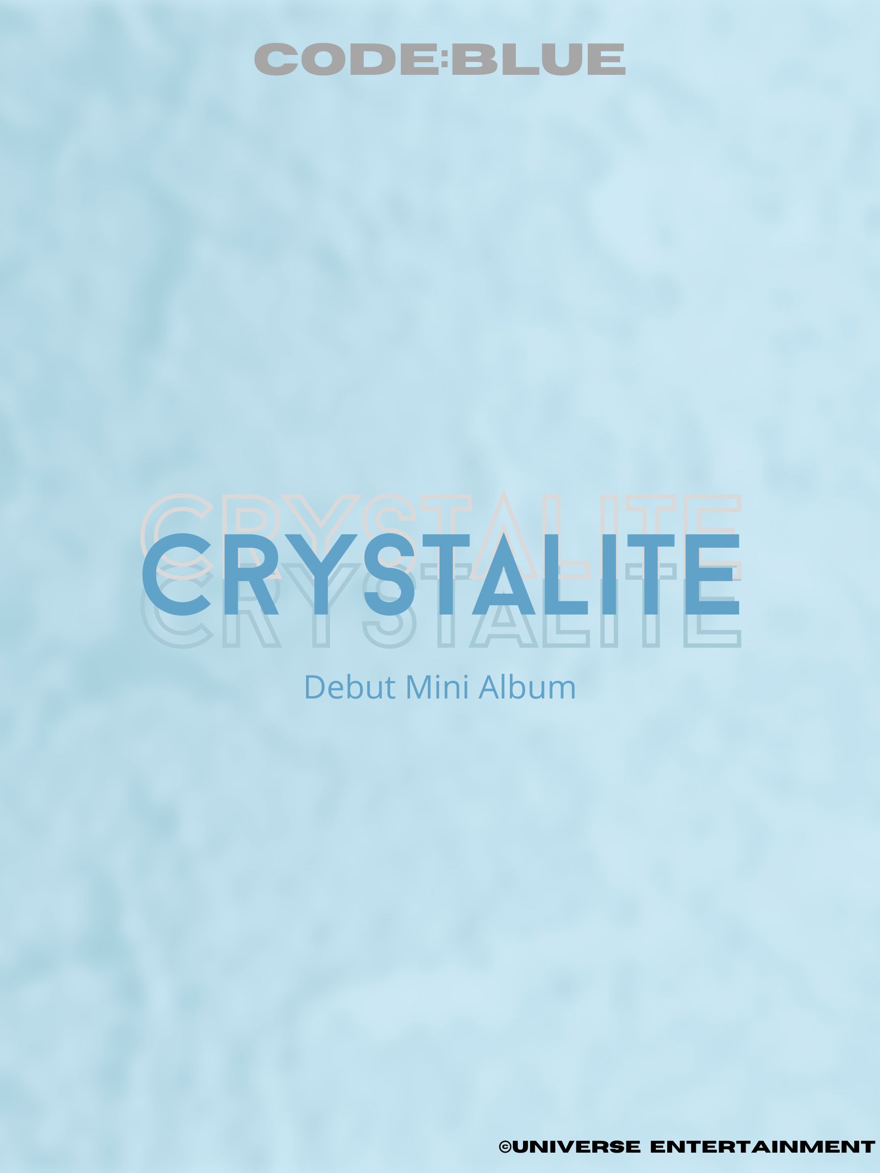
This design is for my fictional boy group Code:Blue. They are intended to be the brother group to Redhot, essentially being their opposites concept wise. While Redhot represents heat with their confidence and ambition, Code:Blue is intended to represent a cooler side with their sincerity and enthusiasm. Crystalite showcases this using different shades of blue on a snowy backdrop.